
SAMSUNG VR DEsign system
ICONOGRAPHY, UI DESIGN, SYSTEMS DESIGN
My first project with Microsoft was a collaboration with Samsung, focused on developing a customer-facing VR headset. The goal was to create a unified UI system that incorporated elements from Samsung’s previous design language while introducing a bespoke design system tailored specifically for Microsoft’s needs.
My role centered on consolidating fragmented design efforts. I gathered the most up-to-date working files and organized them into a single, structured Figma system. From there, I began building a scalable design framework—one that could support cross-functional collaboration, evolve with future updates, and serve as a reliable foundation for product teams moving forward.
RESEARCh and planning
When building a new system, there’s a bit of detective work involved. You start by opening a lot of files, digging deep to spot patterns, inconsistencies, and details that can guide how everything comes together. These early clues help shape a foundation that can scale across the full design system.
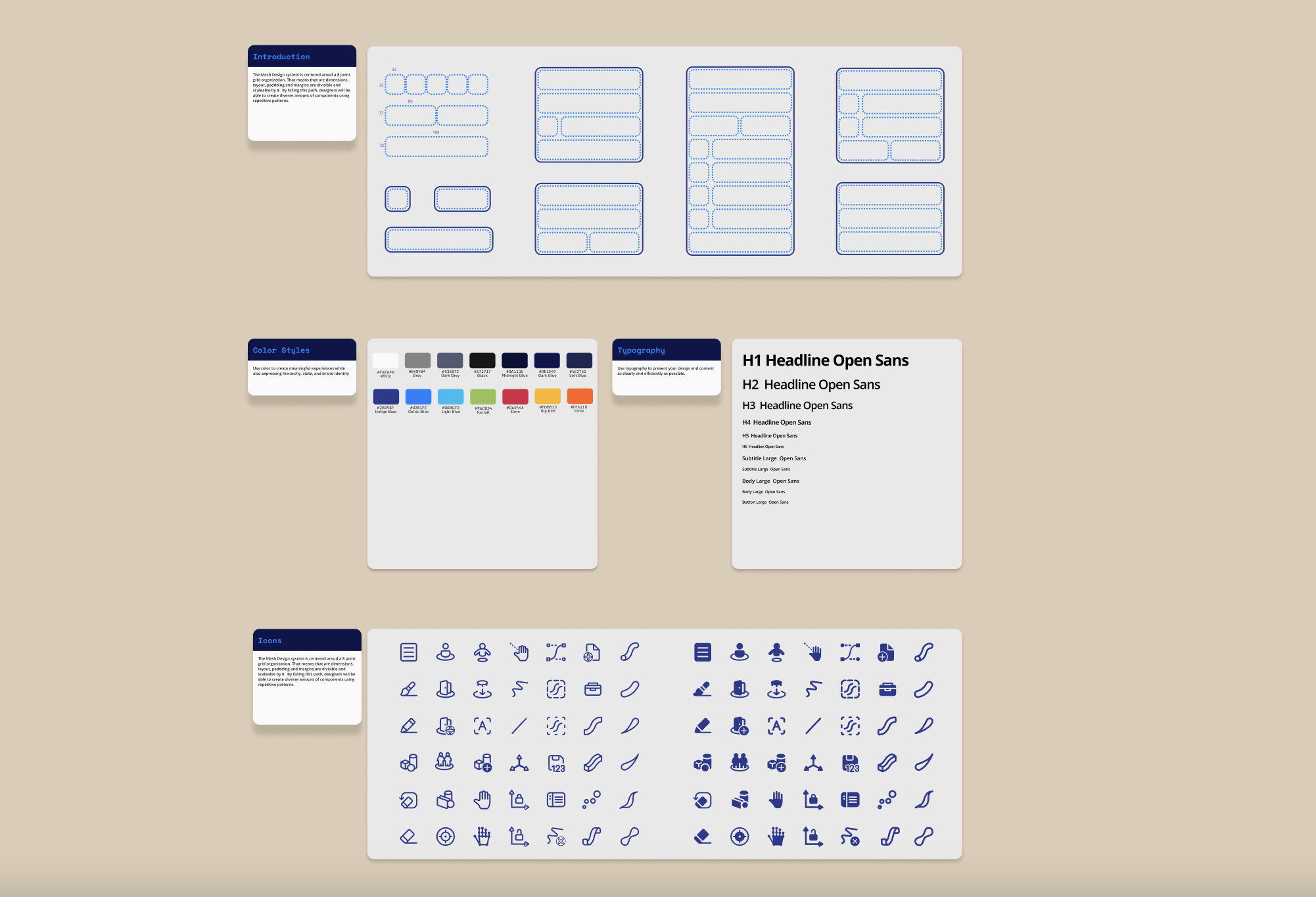
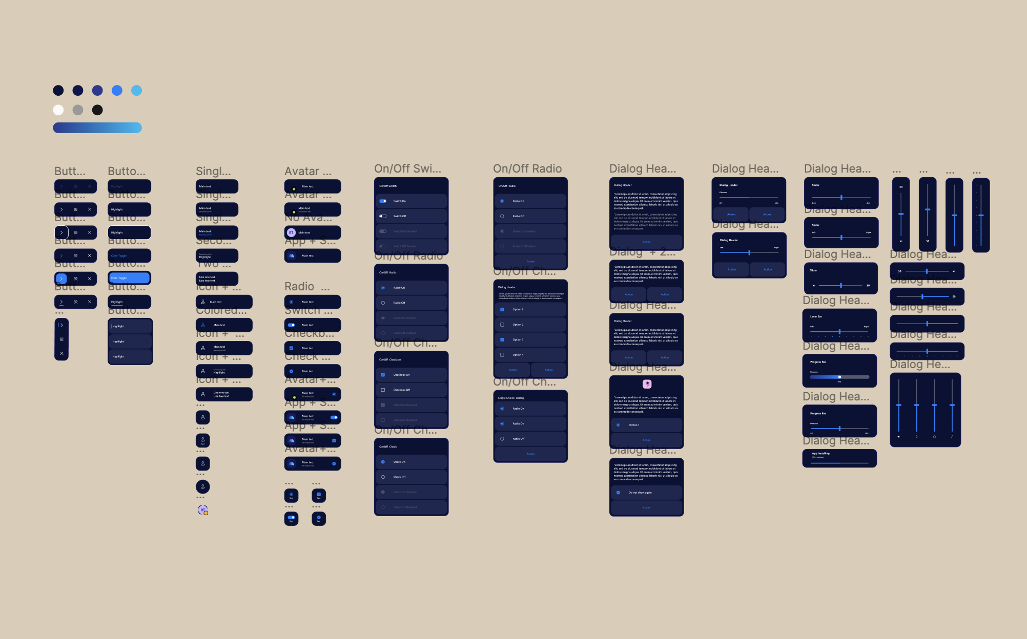
As you go, you’re defining the rules—typography, color, corner radii, padding, stroke weight, and more. These aren’t just visual choices—they bring structure, clarity, and integrity to a product experience.
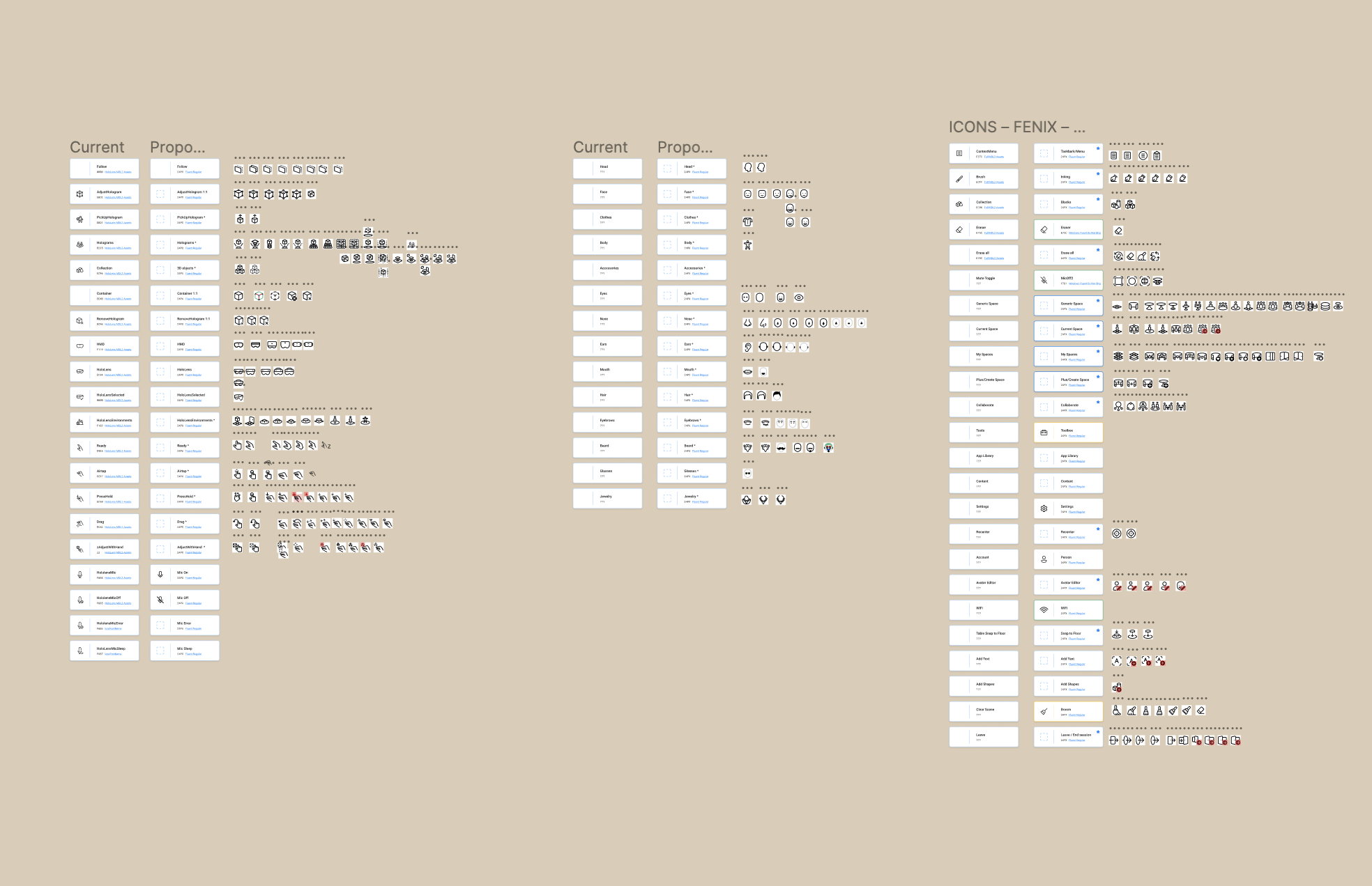
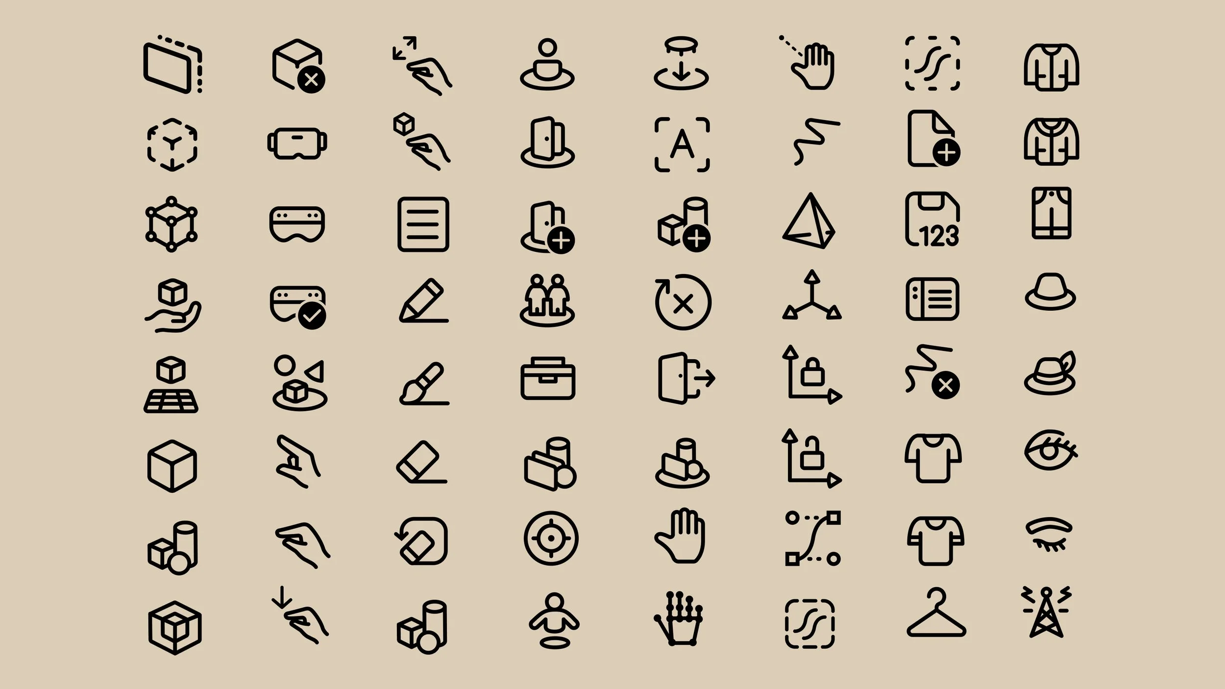
For this project, my focus was on creating a taxonomy specifically for VR components and revising the iconography to align with the evolving visual direction. It was about building a system that feels intentional, cohesive, and ready to grow.
simplify. simplify. simplify.
After combing through various Illustrator files, I began identifying the key elements needed to start building a cohesive system. I focused first on the smallest building blocks—tokens, primitives, and structural patterns—and used those to construct larger, reusable components. The goal was to create a system where a single component could serve multiple needs, giving designers flexibility while maintaining consistency.
As the components came together, I also began shaping the language around them. Naming conventions, classification structures, and property definitions are just as critical as the components themselves. These decisions form the backbone of a design system and must be carefully considered early on to ensure the system is scalable, clear, and collaborative.
The iconography set presented a unique challenge. Working within tight spatial constraints and often abstract metaphors, each icon had to be rigorously critiqued to ensure clarity and meaning. Multiple rounds of exploration were necessary to arrive at a direction that felt aligned, functional, and widely supported across the team.
The outcome
Overall, the project spanned several months and involved extensive exploration across multiple directions. Building a new design system is never straightforward—it’s always evolving. New components and fresh ideas will inevitably challenge what’s already been established.
But when a system is grounded in clear principles and intentional design decisions, it becomes something you can grow and iterate on for years to come. It’s not about locking everything in—it’s about creating a foundation that can adapt.