Microsoft Mesh Logo
LOGO DESIGN, BRAND DESIGN
Designing a logo for Microsoft’s new product, Mesh, was one of the most challenging and rewarding projects of my career. The logo needed to be versatile—maintaining visual integrity across a wide range of sizes, platforms, and devices. It had to feel modern, dimensional, and instantly recognizable, no matter where it lived.
I was excited to take on this challenge and pushed myself to deliver a solution that not only met the brief but exceeded expectations—both my own and the team’s.
research and initial planning
I wasn’t given a lot of formal direction at the start of this project. The logo needed to feel visually aligned with Microsoft’s broader ecosystem, but also reflect certain aesthetic preferences from my creative director—details that weren’t always easy to define. In addition, I was asked to keep a set of guiding themes in mind: flowy, delicate, interconnection, portal, and 3D space.
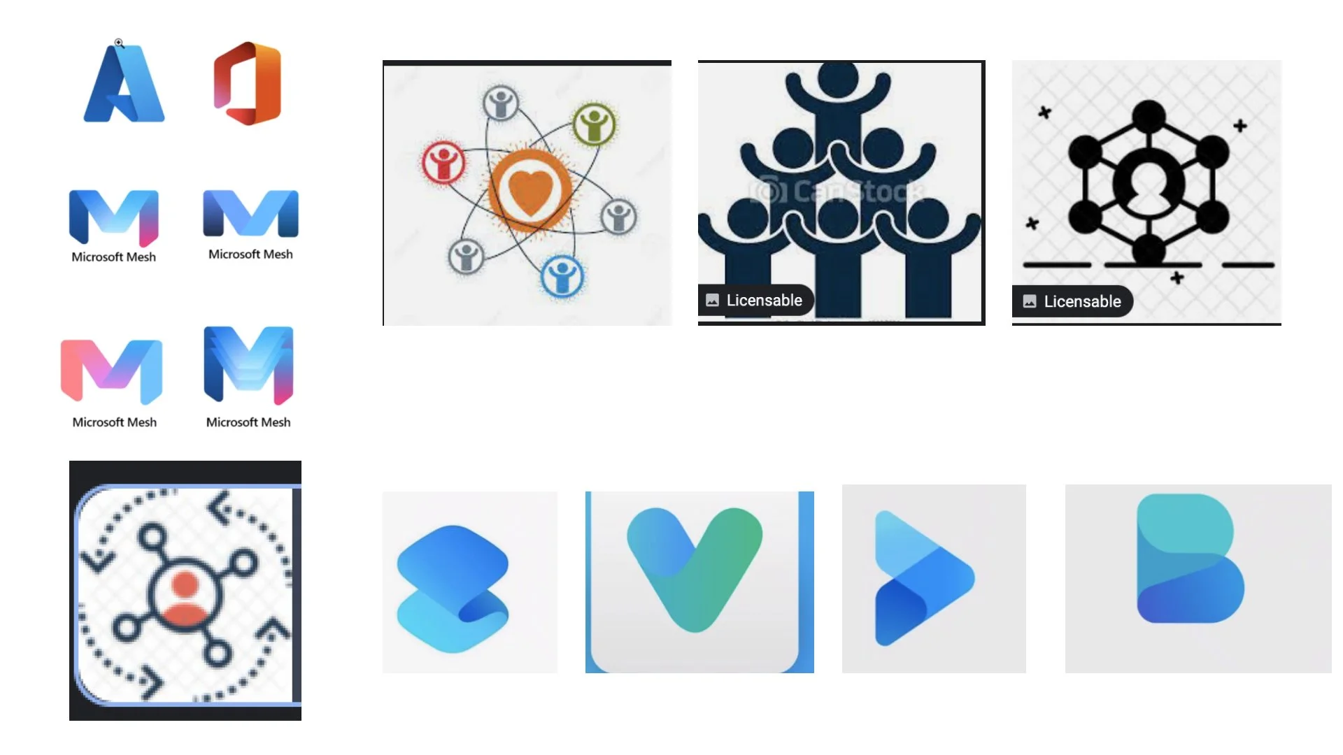
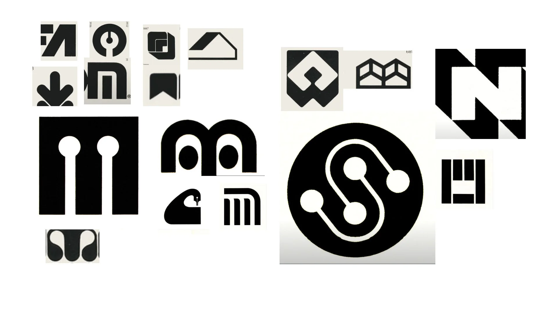
These kinds of constraints can be tricky—but they also open up room for creative exploration. For me, research is one of the most exciting parts of the process. I spent time gathering references across brand, architecture, sculpture, and natural systems, looking for visual cues that could support both the brand’s intention and the emotional tone we were after.
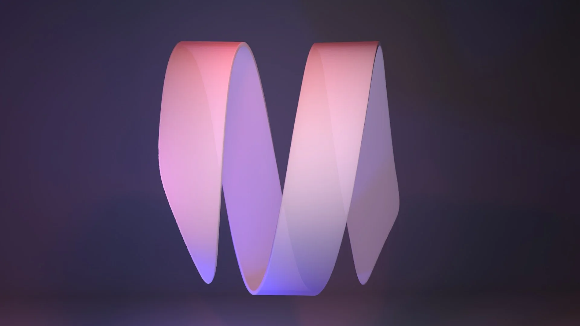
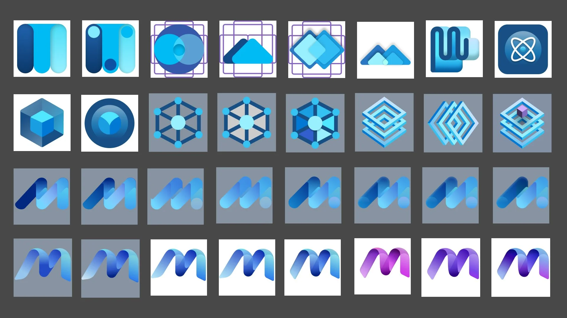
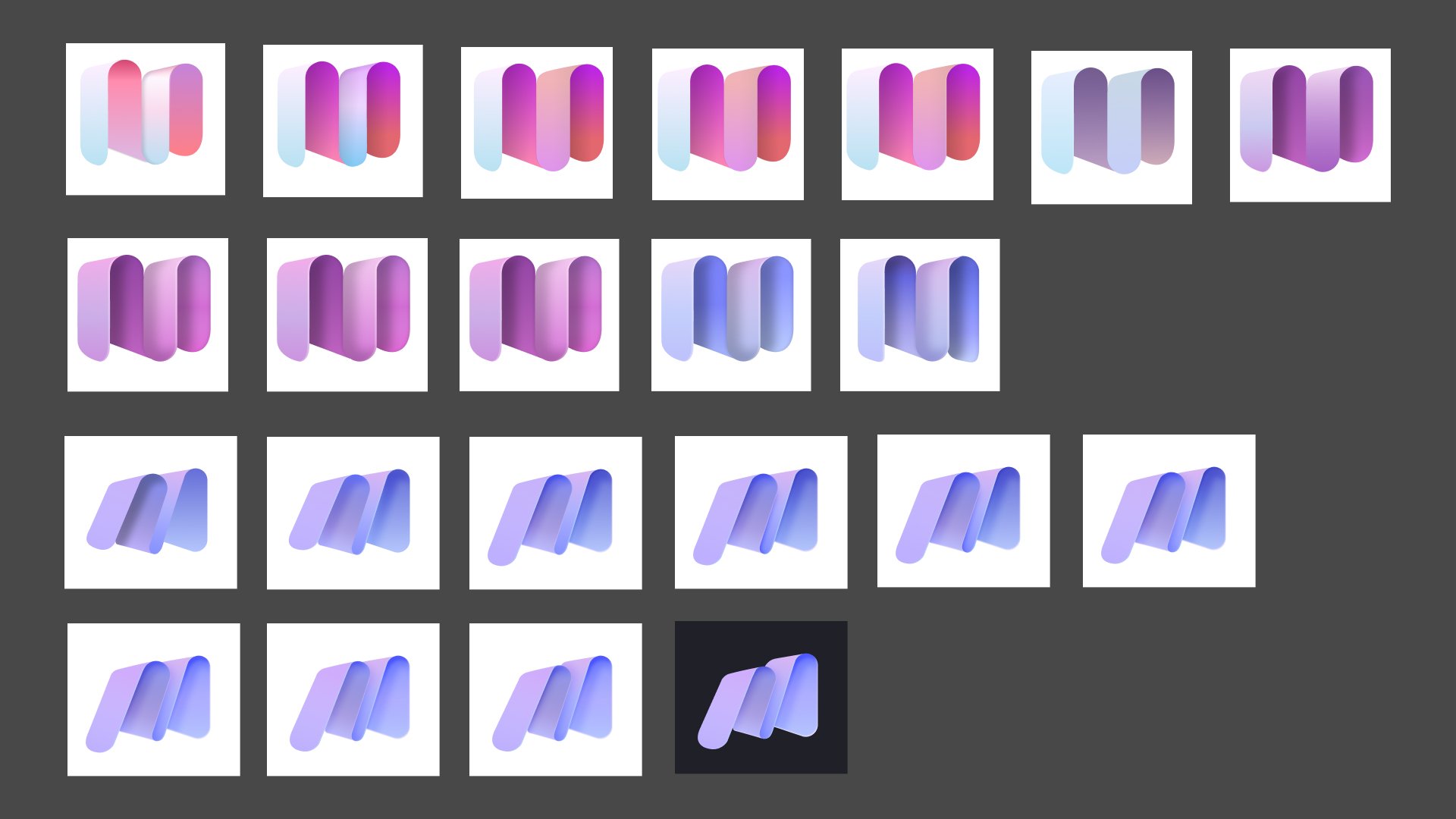
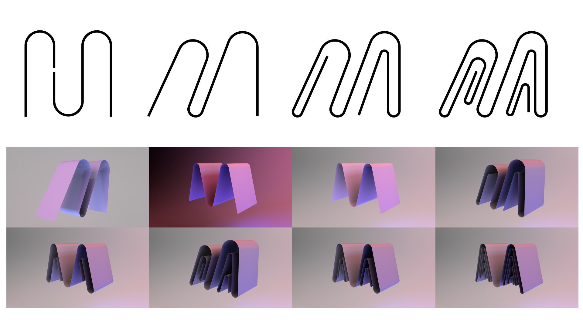
Later explorations began to center around the letter "M"—not just as a literal initial, but as a flexible symbol that could represent connection, motion, and dimensionality. From there, I began iterating on forms that could live comfortably across screen sizes while still evoking a sense of presence and fluidity.
DESigning from the void
When I began designing for this project, I gave myself complete freedom. I started by sketching and creating anything that came to mind—no rules, no restrictions. I believe that early on, it’s important to explore without limitation. As I worked, I continuously added, removed, and filtered through different visual styles and effects—evaluating what felt right, what wasn’t working, and what had the potential to evolve into something stronger. Even if some of those early explorations didn’t make it into the final direction, they helped me better understand the visual vocabulary I’d be working with.
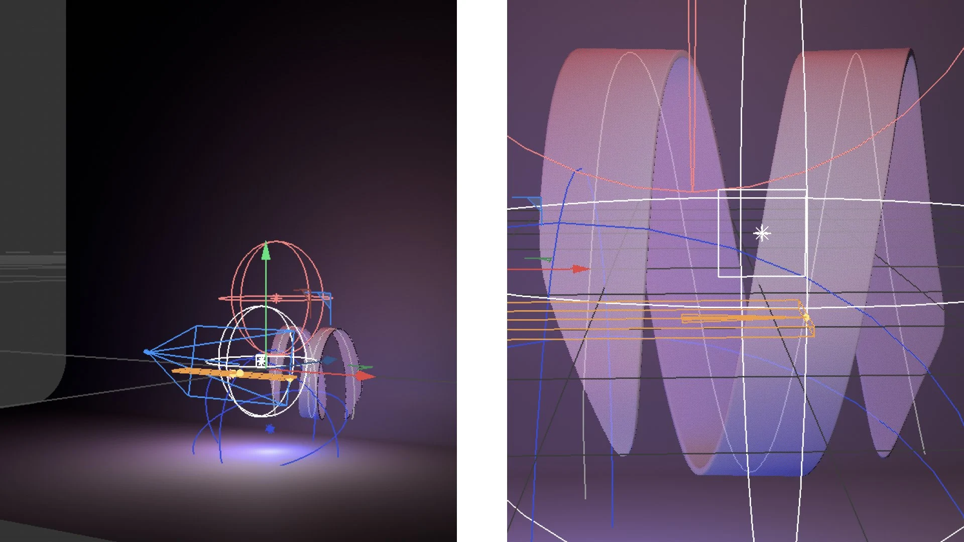
As my direction started to take shape, I brought elements into Cinema 4D to experiment with dimensionality. Working in 3D allowed me to explore how abstract forms could respond to light, shadow, and depth in real time. These rendered outputs became a base that I could bring into Figma, where I refined and manipulated them into more polished, photorealistic assets. While the final image might not be a literal 1:1 translation from 3D to 2D, the process helped ground the logo in something tangible—something that felt spatial, intentional, and real.
The Outcome
This is still very much a work in progress. Each day brings new opportunities for exploration and refinement. As we move closer to launch, my goal is to deliver something that not only meets the needs of the product but also exceeds my own expectations.
I’ll be sharing more updates in the coming months as the work continues to take shape.