Meta Reality labs
ICONONOGRAPHY, DESIGN SYSTEMS
I was brought onto the Reality Labs Design System (RLDS) team to refresh and unify the visual language of their iconography. The existing system lacked cohesion—it felt inconsistent, unrefined, and didn’t convey the premium quality expected across Meta’s products. Visual motifs were scattered, and there was no clear design standard in place.
To complicate things, multiple teams had developed and adopted their own divergent icon sets, which made cross-product alignment difficult. My role was to help consolidate these into a single, scalable system, while also establishing a visual identity that felt intentional, modern, and uniquely Meta.
Research and initial planning
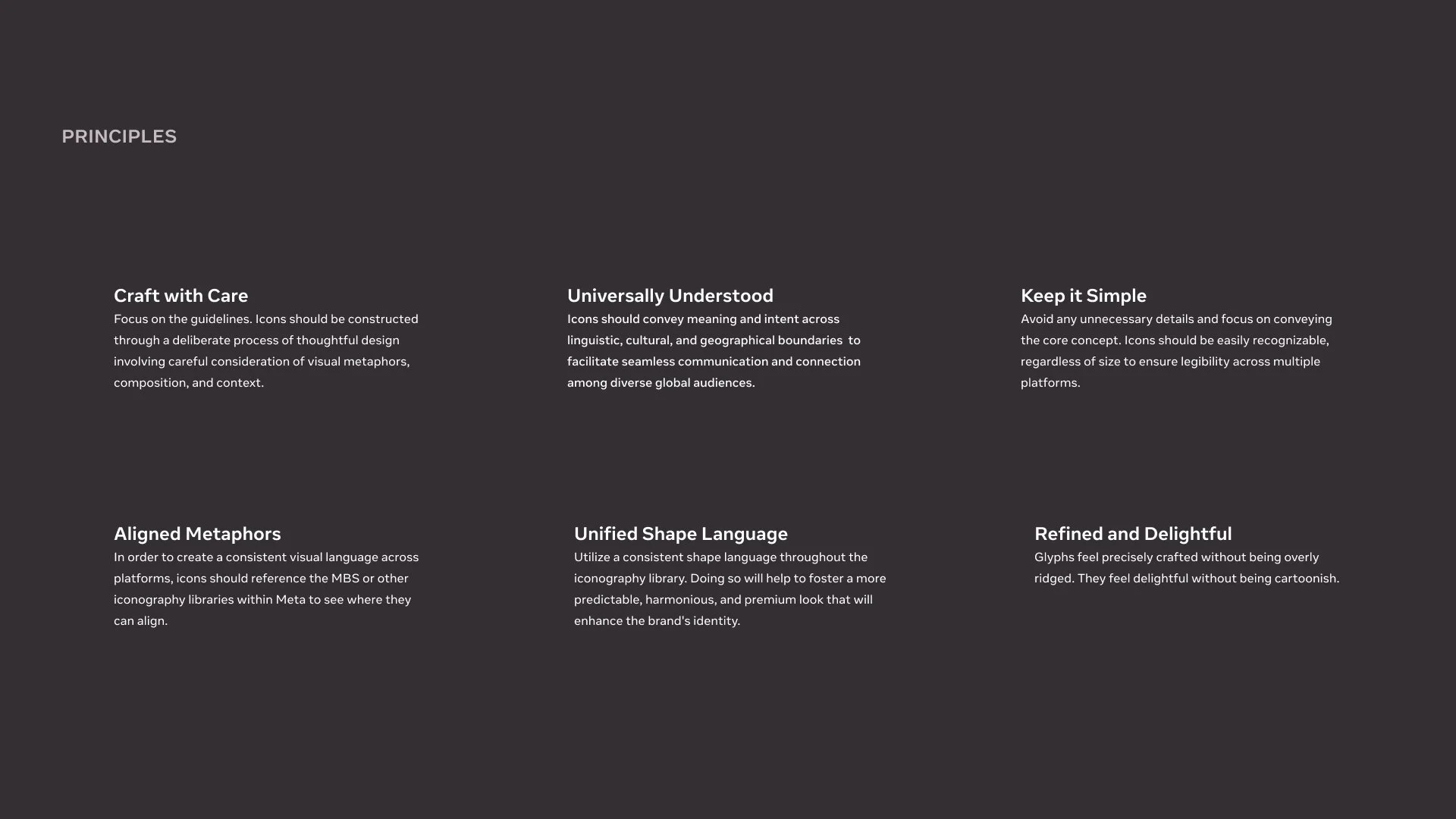
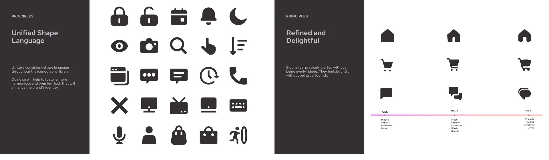
The initial planning phase focused on defining core principles for the new icon system—what was missing from the existing sets, and which qualities we wanted to prioritize moving forward. These principles became our north star, guiding creative decisions and helping us clearly communicate intent to design leadership.
To kick things off, I explored current iconography trends and began prototyping with a set of high-visibility icons. Through iterative exploration, I developed a new stylistic direction and used the first 30 icons to establish foundational patterns. I then applied those patterns across the broader set to ensure visual consistency throughout the system.
Design reviews played a critical role in refining the work. By framing feedback through the lens of our core principles, we were able to align decisions across the team and begin building a strong, scalable visual foundation for the entire icon library.
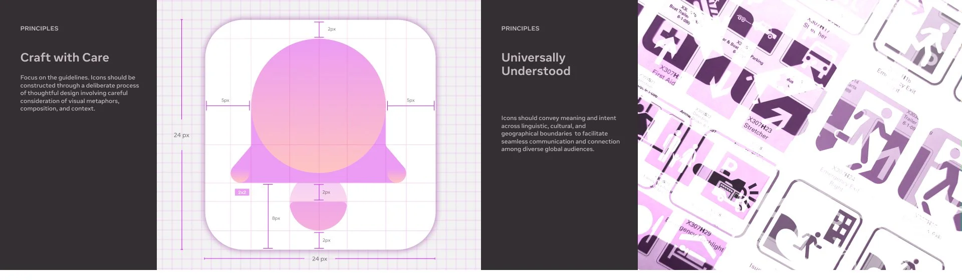
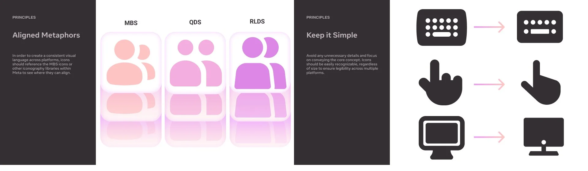
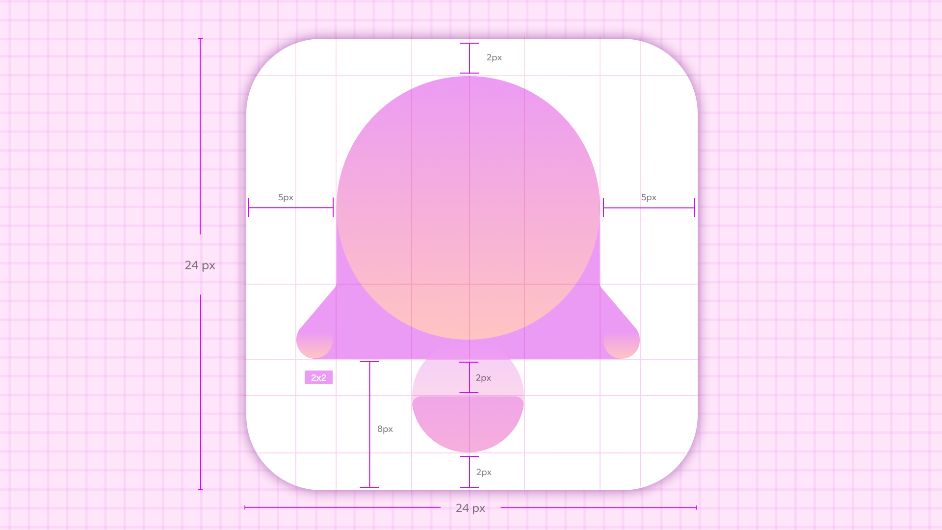
Establishing the Foundation
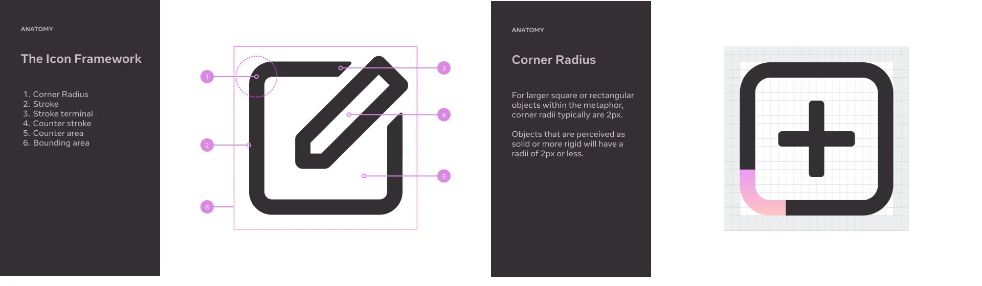
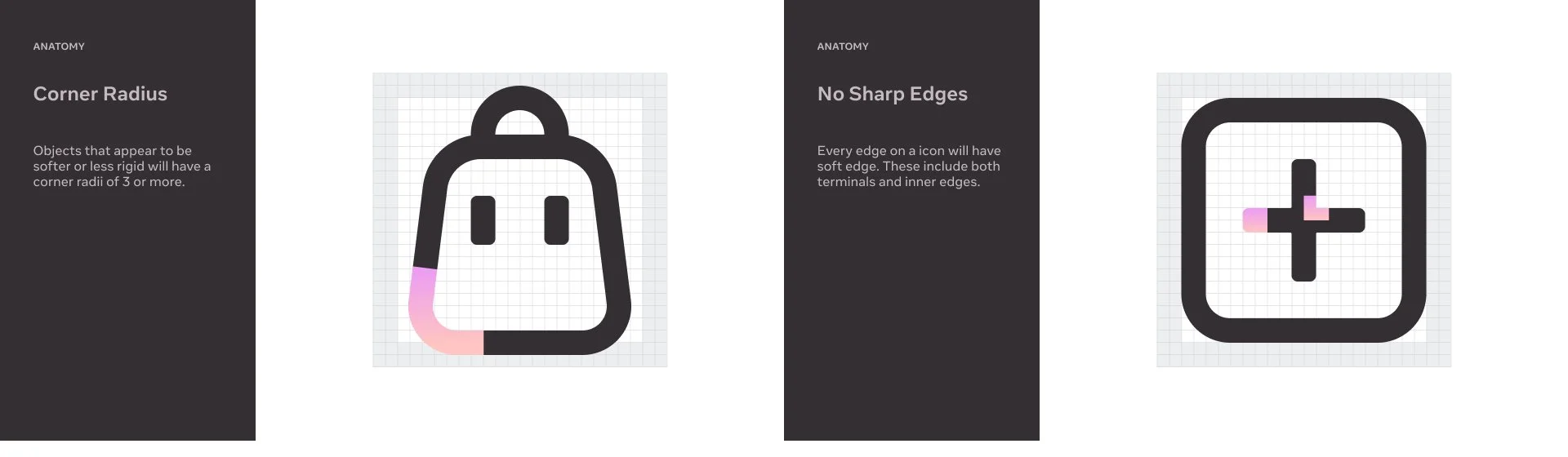
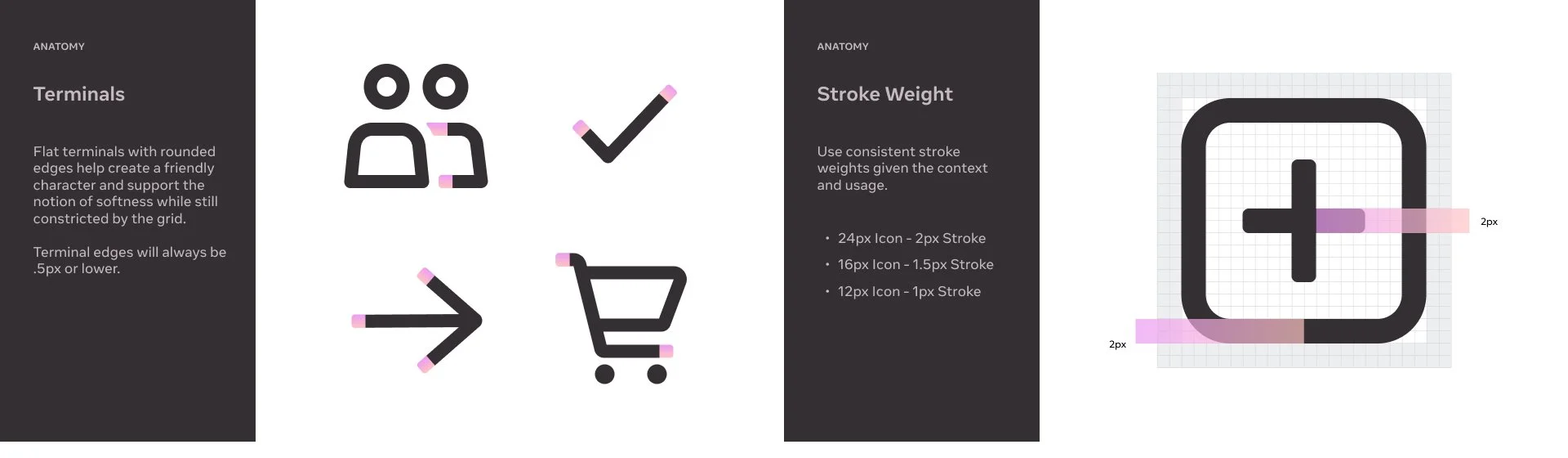
Once we established the core visual language of the icon system, the next step was to define the anatomy and foundational elements that would guide the creation of every icon moving forward. We documented key components—stroke weight, corner treatment, proportions, negative space, and alignment zones—to ensure each icon was crafted with the same level of precision and care.
These guidelines weren’t just about consistency; they were about creating a shared design language that anyone on the team could follow. By formalizing these standards, we built a system that’s not only cohesive today but also flexible and scalable for the future. It allows new icons to be added without needing direct oversight, maintaining the integrity of the visual system as it evolves over time.
Establishing the Foundation
Once we established the core visual language of the icon system, the next step was to define the anatomy and foundational elements that would guide the creation of every icon moving forward. We documented key components—stroke weight, corner treatment, proportions, negative space, and alignment zones—to ensure each icon was crafted with the same level of precision and care.
These guidelines weren’t just about consistency; they were about creating a shared design language that anyone on the team could follow. By formalizing these standards, we built a system that’s not only cohesive today but also flexible and scalable for the future. It allows new icons to be added without needing direct oversight, maintaining the integrity of the visual system as it evolves over time.
outcome
Once I received the green light from design leadership, I moved into full production and delivered over 800 icons within a three-month span earlier this year. With the system's visual principles and construction guidelines already well established, scaling up the icon set became a streamlined effort.
Each asset was meticulously crafted to align with the design language we had defined—maintaining consistency in stroke, proportion, and overall visual rhythm across the entire library. Once finalized, every icon was prepped and exported for engineering implementation. This included production-ready cuts tailored for various use cases and environments across our platform.
Following delivery, we entered a testing phase where the icons were integrated into product builds and evaluated in context. We’re currently working closely with product designers to gather detailed feedback, refine as needed, and ensure the icons meet the functional and aesthetic standards expected at Meta. Our aim is to complete final adjustments and push for release by September.