ALTSPACE VR REVAMP
UI DESIGN, SYSTEMS DESIGN
In 2015, Microsoft acquired Altspace VR—but for years, the platform saw little development. That changed quickly when Facebook announced its plans for the Metaverse. Within days of that announcement, our team was tasked with revamping Altspace VR and bringing it up to speed—both visually and experientially—to better align with Microsoft’s current design language and product direction.
Research and planning
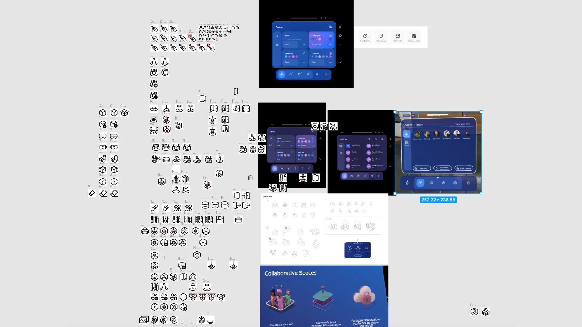
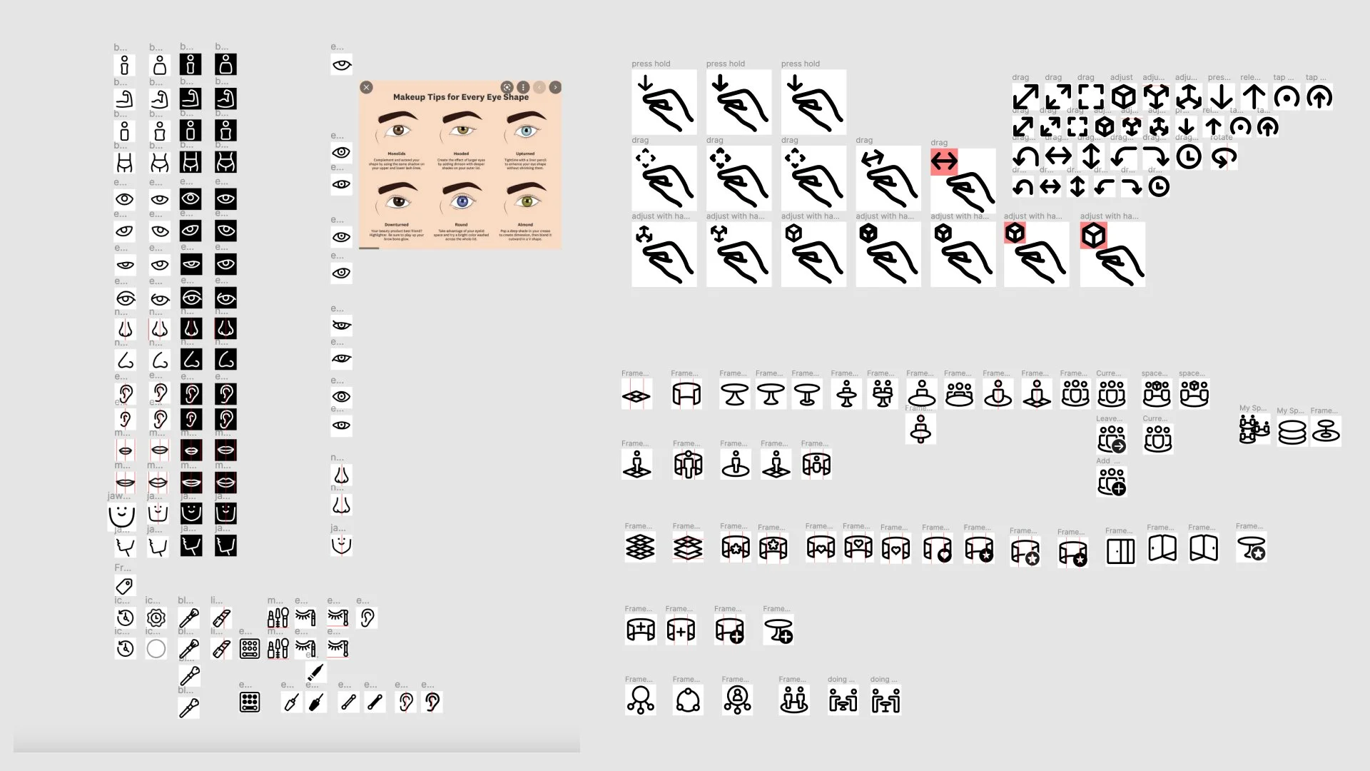
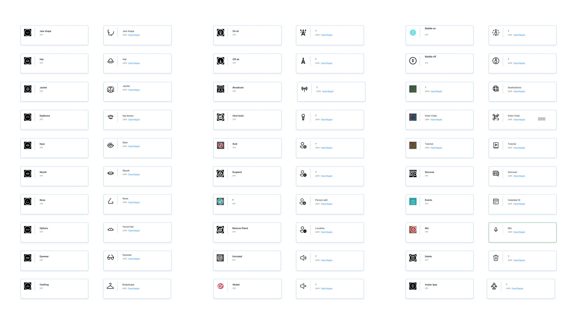
My role in this project was to completely overhaul the iconography across the Altspace VR platform. At the time, there was no existing design system in place to scale or maintain the icons, so I created one from the ground up—drawing inspiration and structure from Microsoft’s Fluent Design System.
A major part of the work involved unpacking the logic behind the original icon metaphors and reinterpreting them into a new, cohesive visual language. On the surface, it may sound straightforward—but without access to the original creators and working within the abstract, often ambiguous space of virtual reality, the process required a lot of careful deduction and creative problem-solving.
exploring the future
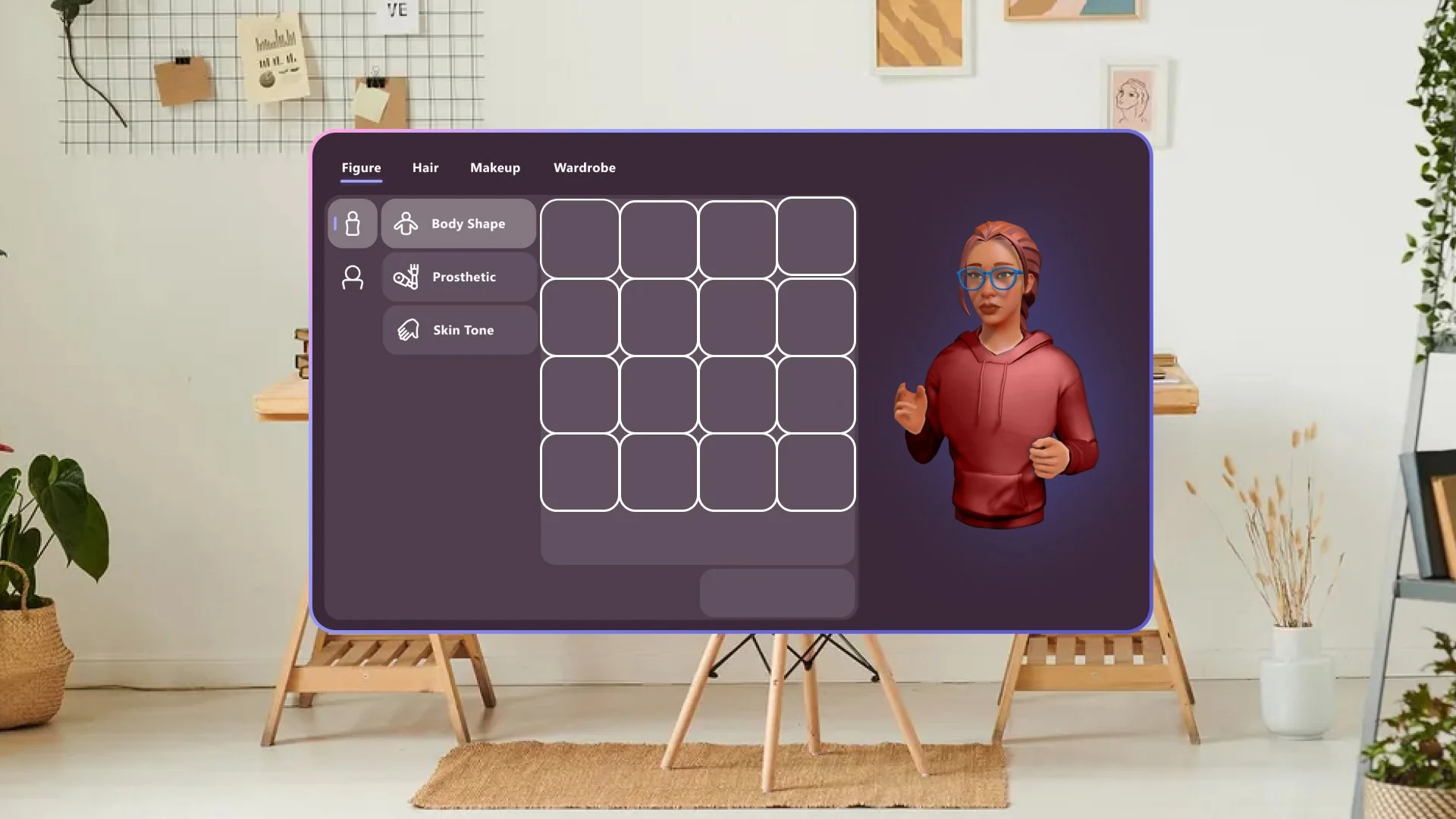
As I began updating the existing icon set, my role naturally expanded to include work on the avatar creation sub-menu. This part of the platform required a deep dive into a wide range of avatar-related icons. I explored multiple variations to better understand how each icon functioned within the broader user experience.
To support this, I created a simple UX flow to illustrate how users would navigate the avatar generator—from customization options to final selection. While the flow itself was relatively straightforward, landing on the right visual tone for each icon proved to be a much more nuanced process. It took time, iteration, and rounds of critique, but in the end, the pieces came together into a cohesive, intuitive interface.Icons for Mesh
the outcome
Although icons can be easy to create, this project took several months to complete. The icons went through rigorous critiques and many updates were made as we progressed toward launch. Even my user flow has gone thru several iterations. Nothing stays static in design and being able to transition and explore new options will always be on the table.