Brand Visual System for Adobe
BRANDING, SYSTEMS DESIGN
I was brought onto the Adobe Brand Team to help evolve and refine their existing brand visual system. By reviewing earlier efforts, I identified foundational patterns that could support a more cohesive and scalable design narrative across platforms.
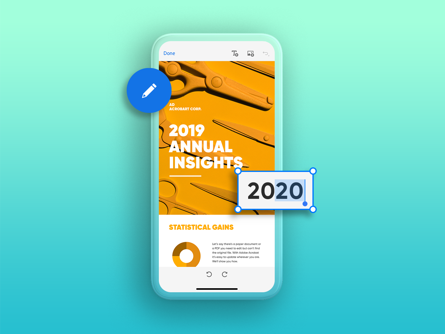
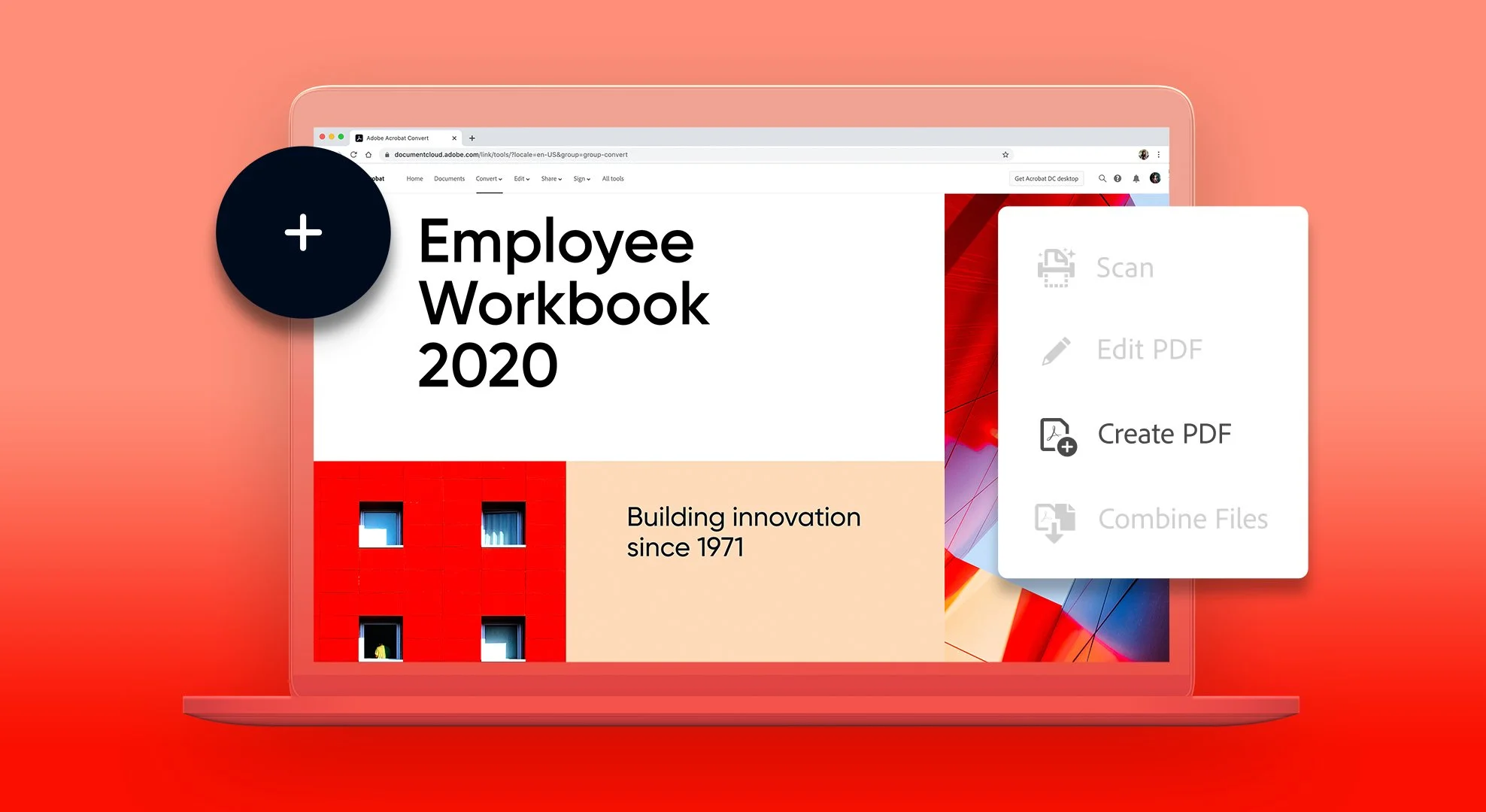
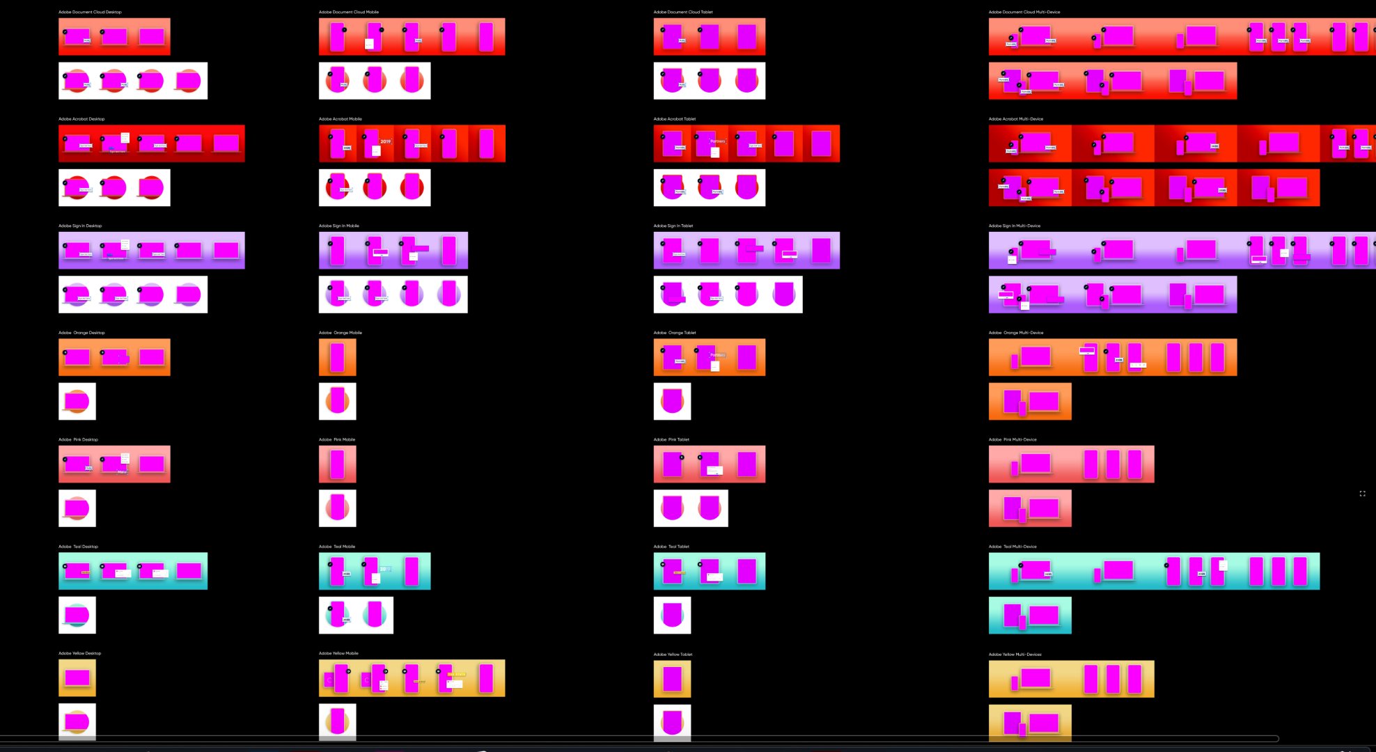
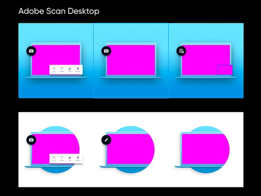
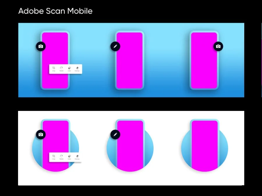
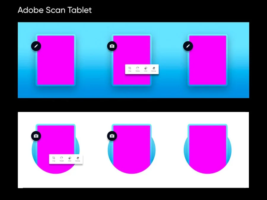
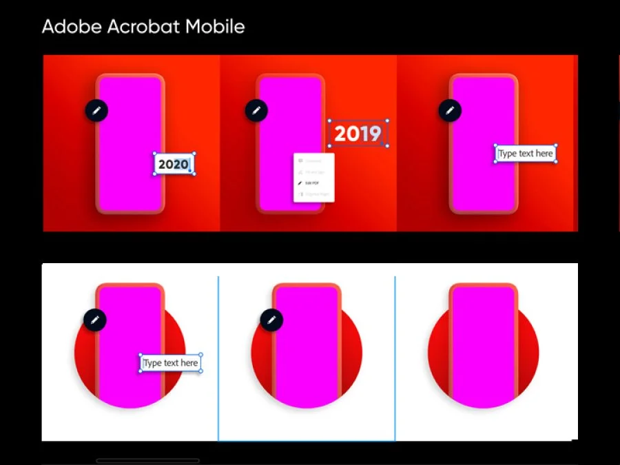
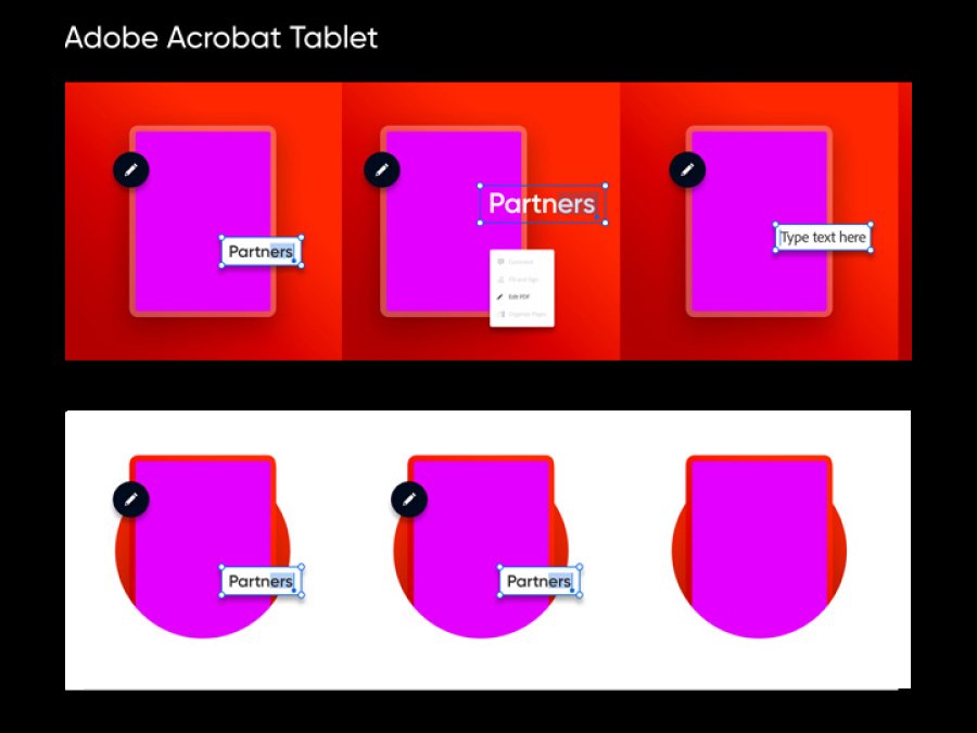
I developed a range of responsive lockups tailored to different devices and applied them across four key Adobe products: Creative Cloud, Acrobat, Sign, and Scan. In total, I delivered over 120 assets within a tight three-week timeline, while also contributing supplemental updates to Adobe’s internal style guide to ensure alignment and future scalability.
REsearch and planning
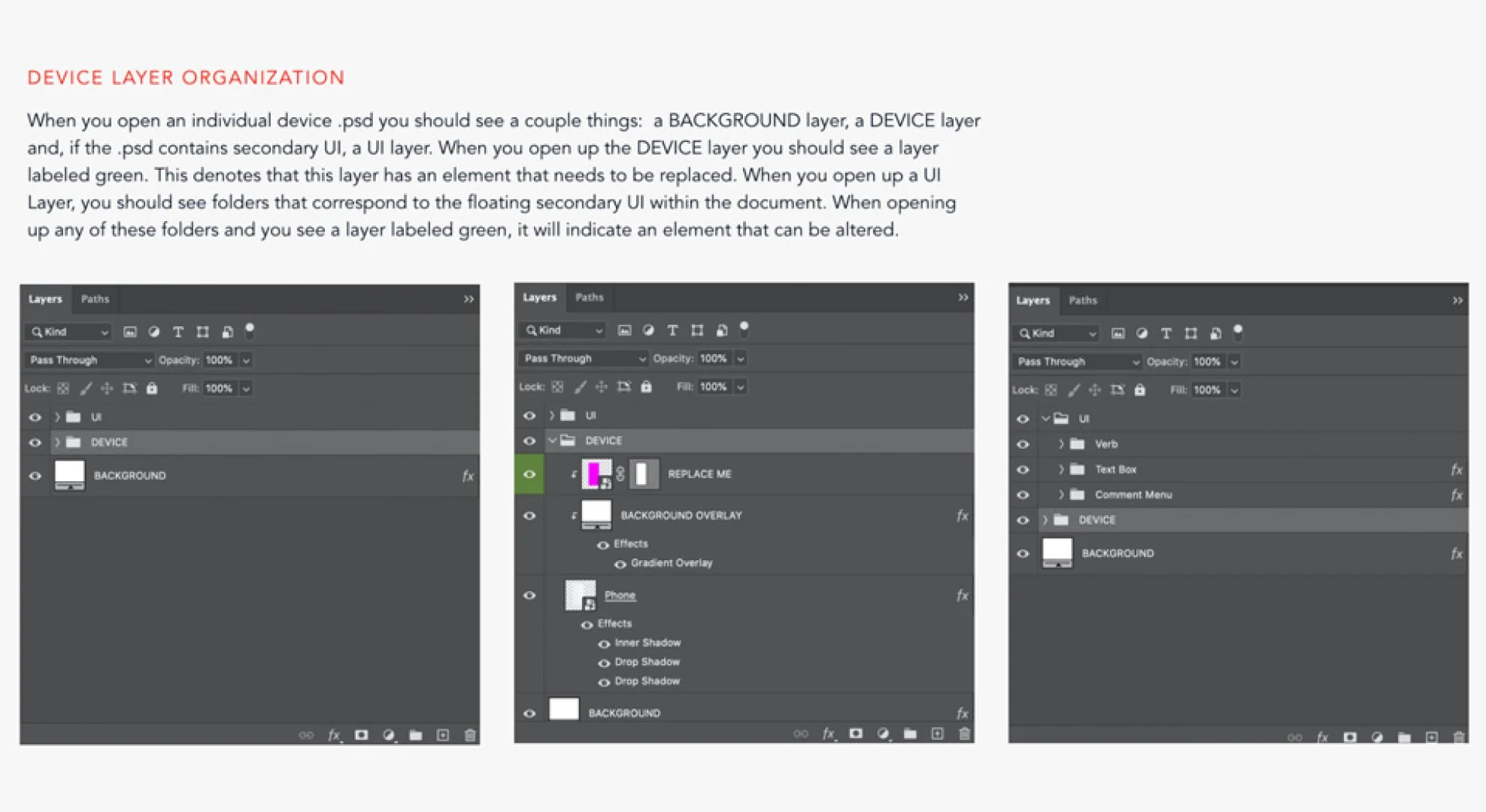
After joining the team and getting a clear rundown of the project goals, I knew exactly where to begin: the source files. I opened every file related to the brand system and broke them down—disassembling the structure to understand how they were built, what was working, and how elements could be reorganized more effectively.
From there, I began pulling out the essential visual elements that could be translated into reusable patterns and components—forming the foundation of a new, scalable design system. Once I had evaluated the quality and structure of the existing assets, I outlined a few key objectives for the new system:
Consistency – Each file should follow defined patterns, components, typography, and color usage that align with the overall visual aesthetic.
Scalability – The system should be flexible enough to grow, allowing new assets to be added without compromising the foundational rules.
Usability – Since these files are shared across internal and external design partners, they must be structured intuitively, with well-organized layers that are easy to navigate.
This approach allowed me to establish a strong system that not only delivered on immediate project needs but also created a reliable framework for future work.
visual design
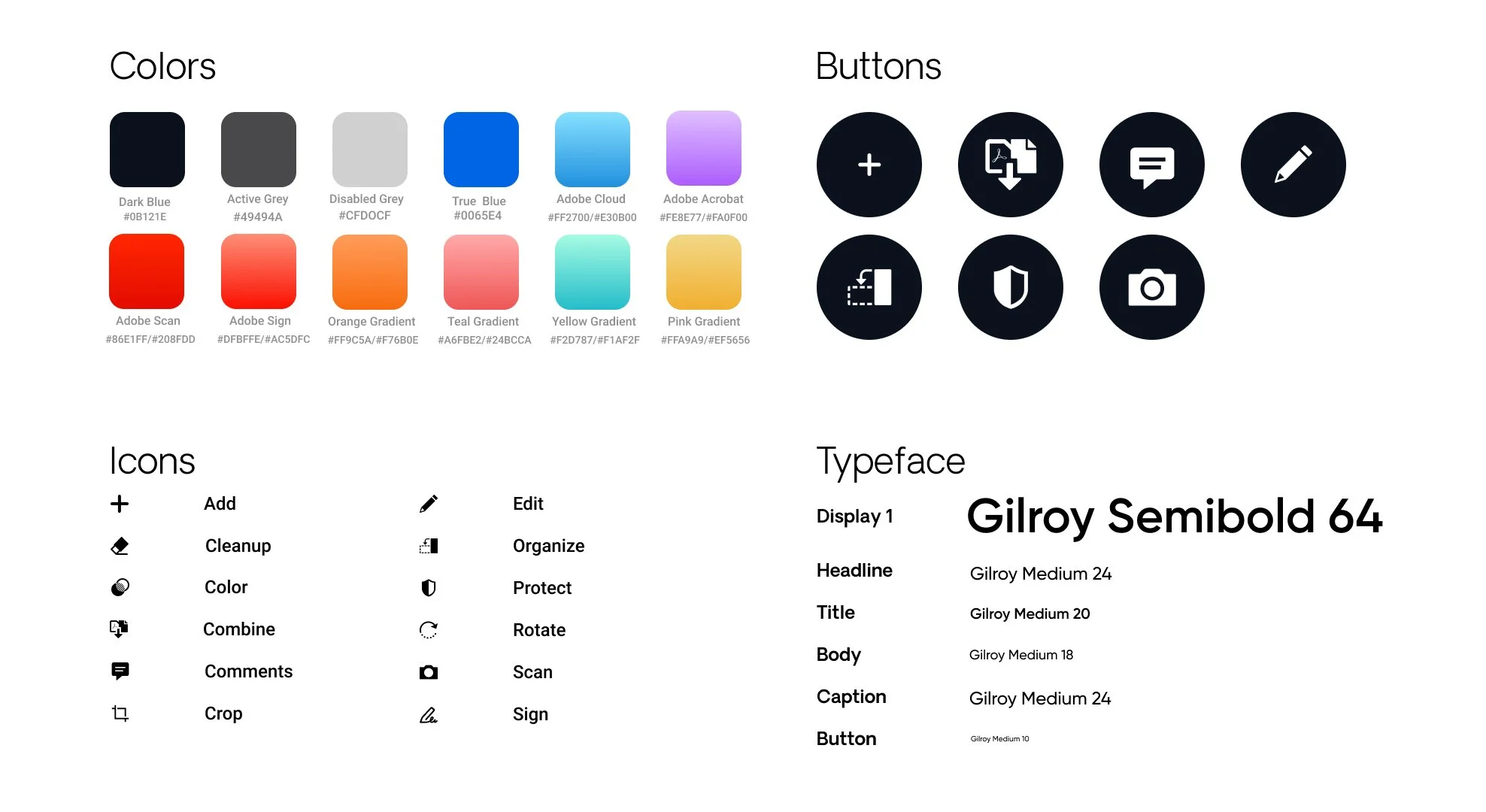
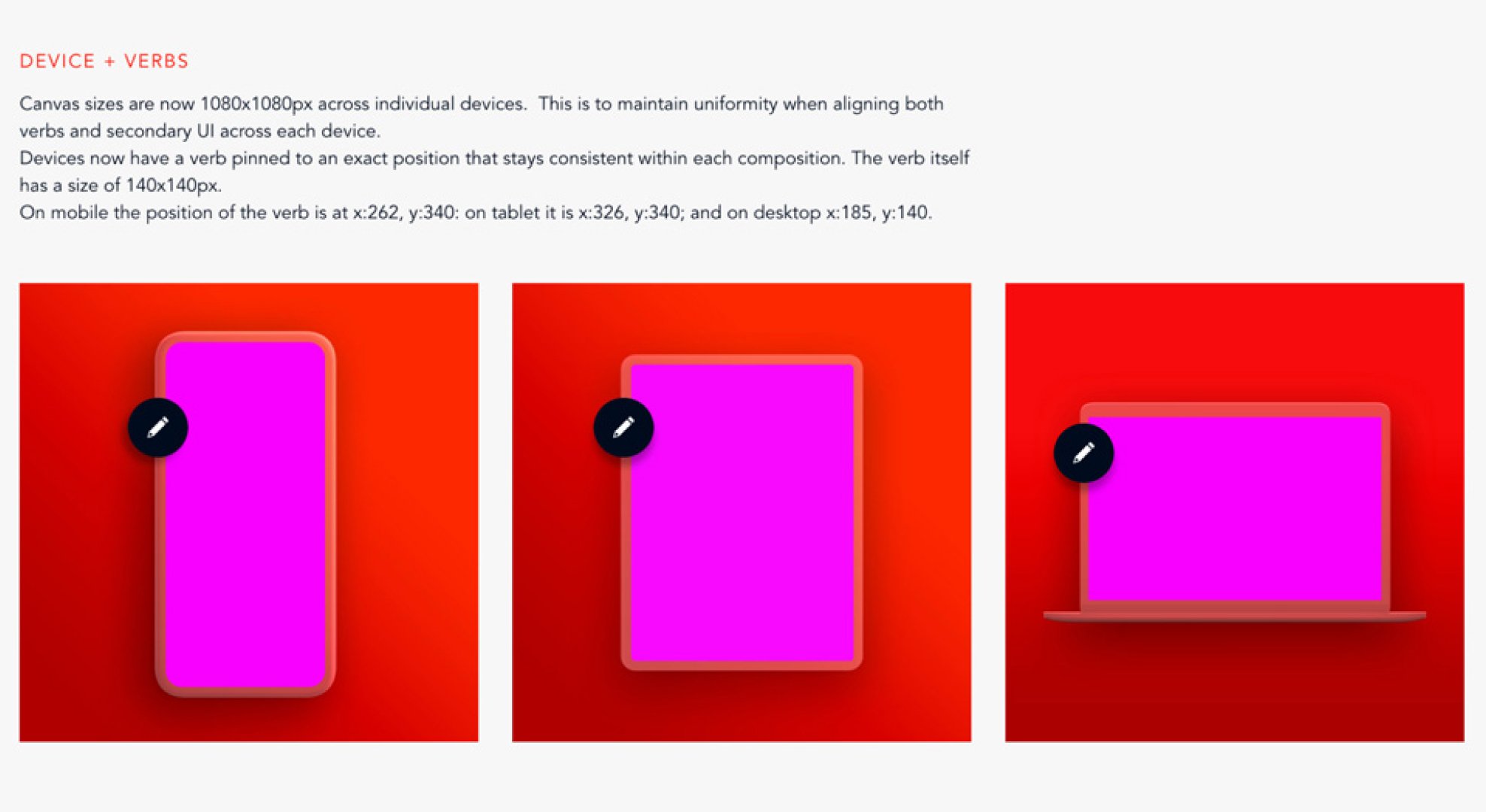
Once the source files had been fully examined and the design framework was in place, reconfiguring each file became a much more streamlined process. As I worked through the content, I began identifying and isolating repeatable patterns—assembling them into a visual toolkit that could support the system as a whole.
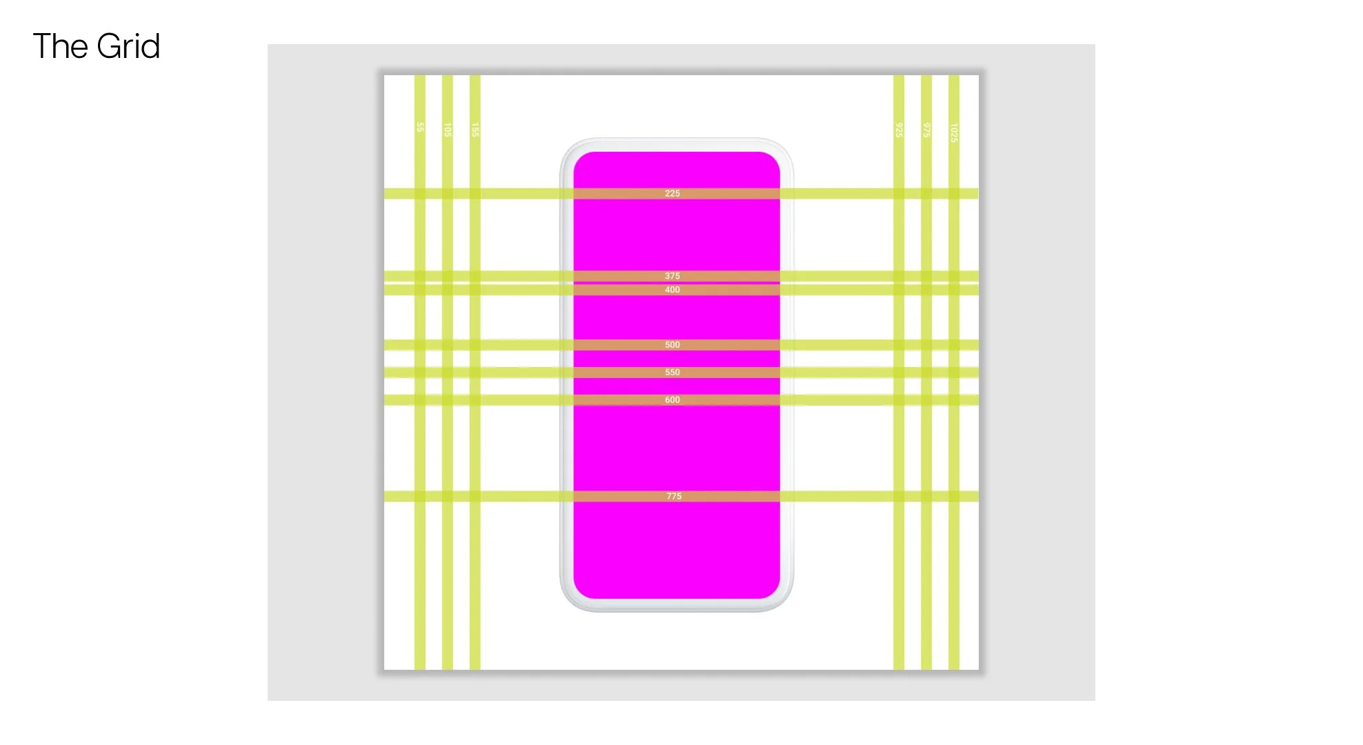
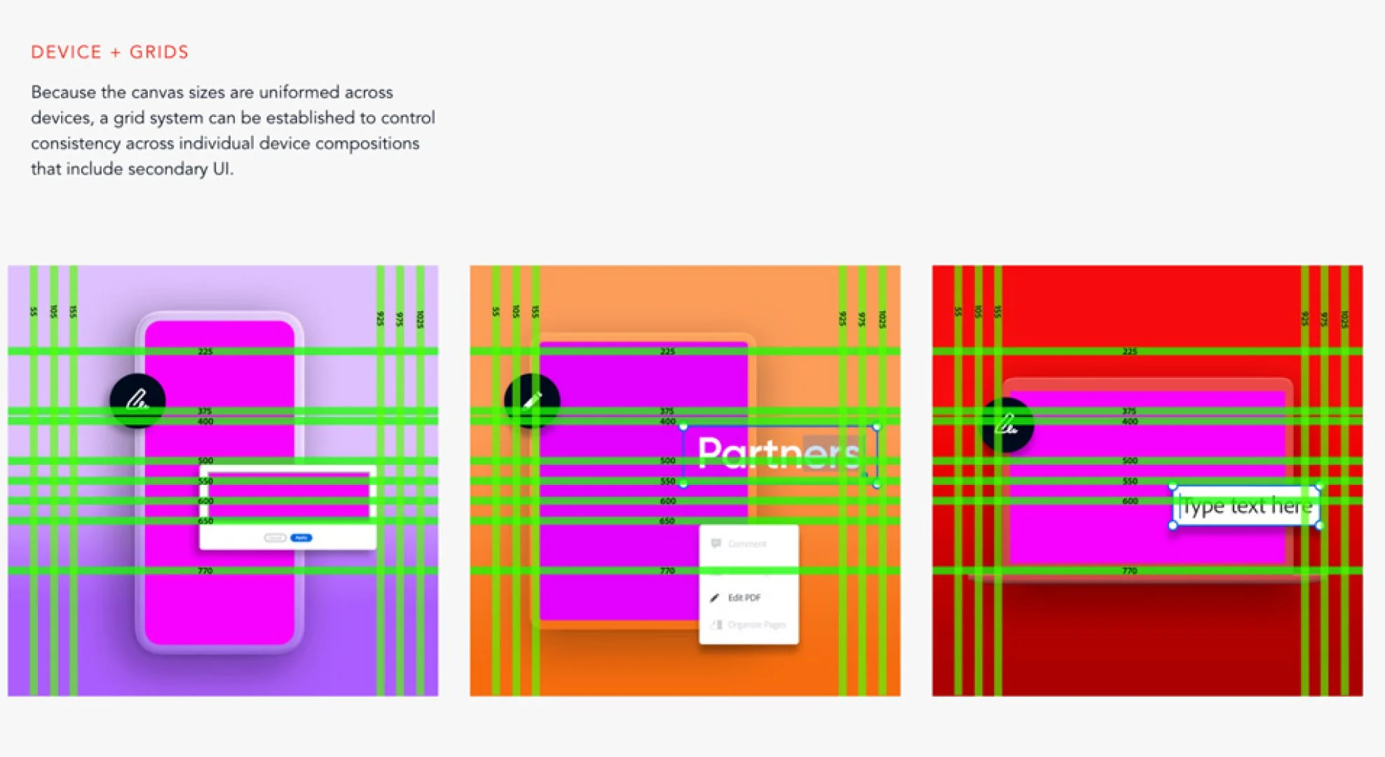
As the toolkit grew more comprehensive, it became a reliable resource for answering design decisions and sped up the production of subsequent files. Toward the end of the project, I also developed a layout grid to help consistently organize components on the artboards, further reinforcing structure and clarity across deliverables.
the outcome
In the end, I delivered over 120 fully layered PSDs in just two weeks, covering three different device formats. These assets supported a wide range of product features, including UI states, brand lockups, and visual treatments tailored to each platform. Each file was built to be easily editable and production-ready—allowing teams to quickly adapt and repurpose them as needed.
Beyond asset delivery, I also contributed supplemental documentation to the team’s style guide. This included notes on grid usage, padding, layout conventions, and component behavior—helping to codify the new visual rules introduced by the system. These additions not only supported internal consistency but also made it easier for external partners and collaborators to work within the same visual framework.

REflections
Looking back, I had a fantastic experience working with Adobe’s Brand team. This project gave me the opportunity to apply years of design experience toward building a system that not only functions seamlessly on a technical level but also maintains a distinct and intentional visual aesthetic.
It was a rewarding challenge from start to finish, and I truly enjoyed collaborating with the team. I’d be excited to work with Adobe again in the future.